info@nelsonkb.com
 832-998-6598







What is an Analogous Color Scheme?
Why It’s Trending in 2025 Kitchen Design
In 2025, kitchen design is all about warmth, personality, and visual flow, and that’s exactly why analogous color schemes are having a moment. With the move away from stark minimalism and clinical white kitchens, homeowners are craving spaces that feel more connected, calming, and expressive. Analogous palettes deliver just that. They offer enough variety to keep things interesting, but maintain a sense of harmony that’s easy on the eyes.
Designers are embracing these schemes to reflect natural environments, boost mood, and create kitchens that blend seamlessly into open-concept living areas. Whether you’re going bold with jewel tones or soft with sage and olive, the analogous approach is a stylish way to tie it all together.
| Pros | Cons |
|---|---|
| Creates a calm, cohesive look | May lack strong contrast or visual drama |
| Easy to match tones for cabinetry, walls, and décor | Can feel too “safe” or monotonous if not styled carefully |
| Versatile across design styles (modern, rustic, etc.) | Requires thoughtful layering to avoid looking flat |
| Great for open-concept layouts | Might limit bold accent options |
| Reflects nature-inspired and wellness-oriented trends | Not ideal for lovers of high-contrast color combos |
See how our designers can create your Dream Kitchen

Get a free 2D layout
Design & layout with as many revisions until it’s perfect!

3D rendering
High quality, realistic 3D rendering of project within 24 hours!

Itemized quote
Quotes are detailed, transparent, and come with 15 day Price Gurantee!

Professional Grade Design
Professionalism and quality so good, 15,000+ families have said YES!
Popular Analogous Color Palettes for Kitchens
1. Sage – Olive – Forest Green

This green-based palette is rooted in nature and creates a grounded, calming kitchen atmosphere. Sage brings a soft and airy vibe, olive adds earthy depth, and forest green provides richness and elegance. Together, they work beautifully on cabinetry, accent walls, or backsplashes. This palette is perfect for homeowners seeking a serene, wellness-inspired space. Pair with light wood, brushed gold hardware, and plenty of natural light for a modern organic look. These tones are especially popular in Japandi, Scandinavian, and minimalist kitchens that embrace sustainability and subtle luxury. It’s also an ideal choice for bringing nature indoors in urban homes.
2. Terracotta – Rust – Burnt Sienna
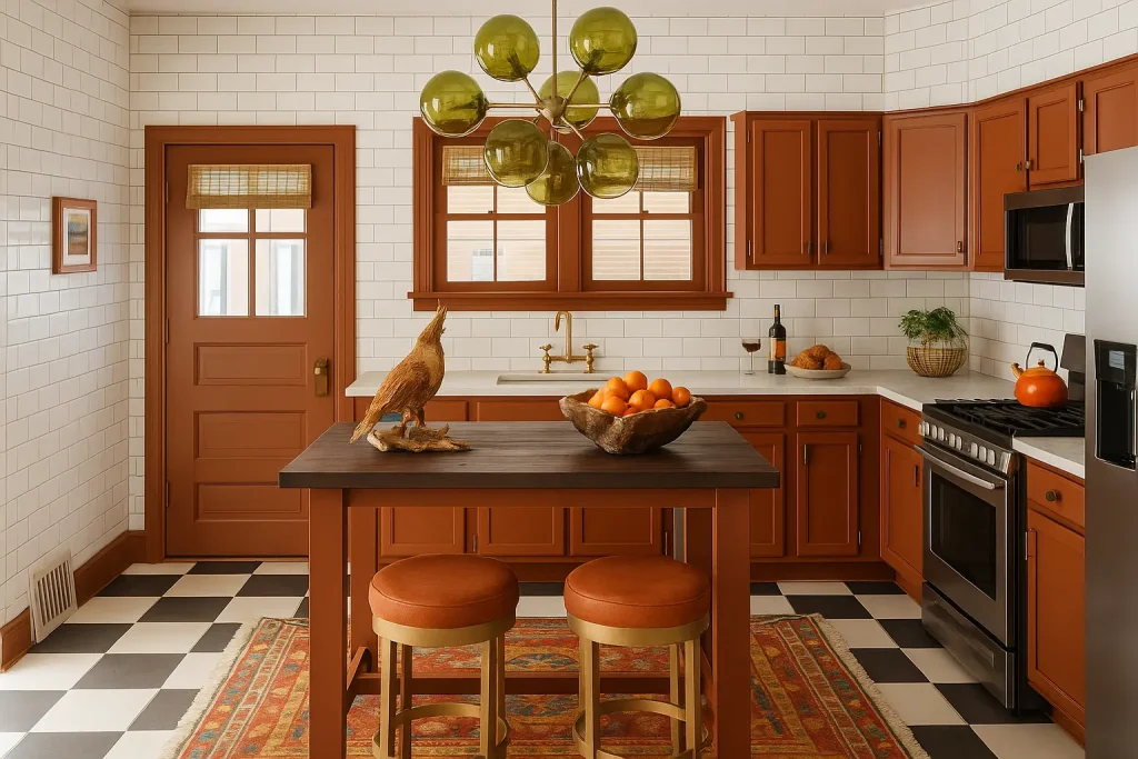
Warm, cozy, and full of soul, this trio channels Mediterranean warmth and vintage charm. Terracotta provides an earthy base, rust brings a sunbaked richness, and burnt sienna deepens the mood. This palette is perfect for creating a welcoming kitchen that feels handcrafted and lived-in. It pairs well with natural textures like stone, ceramic, and warm-toned wood. These colors are often used in farmhouse, rustic, or bohemian kitchen styles. Add open shelving with handmade pottery or copper accents to elevate the artisanal feel. If you want your kitchen to feel timeless, grounded, and full of warmth, this is the palette to explore.
3. Navy – Cobalt – Periwinkle

This cool-toned palette delivers a bold yet sophisticated look that works beautifully in contemporary kitchens. Navy cabinets offer a grounding base, cobalt adds vibrancy, and periwinkle softens the edges with a gentle lavender-blue tone. These hues bring depth and elegance without overwhelming the space. They shine when paired with white marble countertops, sleek metallics like chrome or nickel, and minimalist cabinetry. This palette also photographs well, ideal for design-forward homes or content creators. Whether used on cabinetry or as accent walls, this trio creates a rich, coastal-inspired vibe that feels crisp, confident, and just a little daring.
4. Blush – Rose – Dusty Mauve
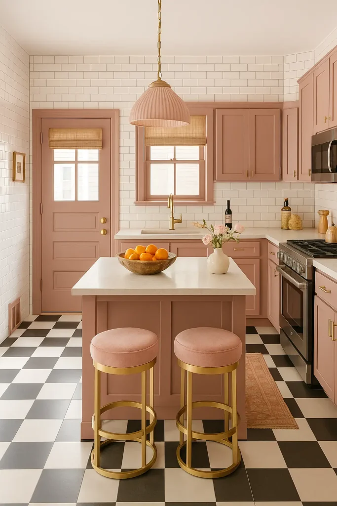
Romantic and soft without being overly sweet, this palette plays with muted pinks for a sophisticated, modern kitchen. Blush offers a light and airy foundation, rose adds warmth and depth, while dusty mauve brings in a touch of vintage charm. Together, they create a gentle flow that feels both stylish and calming. Ideal for small kitchens or apartments where light is key, this palette pairs well with brass fixtures, terrazzo countertops, or light oak cabinetry. These tones are increasingly popular in feminine, glam, and soft-modern interiors that seek subtle color without harsh contrasts. A perfect balance of charm and chic.
5. Mustard – Gold – Ochre

This vibrant yellow-gold palette brings cheerful energy and a retro twist to the kitchen. Mustard acts as a bold anchor, gold provides a touch of glam, and ochre rounds out the trio with warm, earthy balance. These colors are fantastic for creating a kitchen that feels sunny, inviting, and full of personality. Use them on cabinet fronts, bar stools, or tiled backsplashes to make a statement. They pair well with walnut wood, matte black accents, and vintage-style appliances. This palette works particularly well in mid-century modern, boho, or eclectic kitchens where color is embraced as part of the design story.
Is It Right for You?
Final Thoughts
Looking for new cabinets? Gray Collection or White Collection

Nelson Cabinetry
Nelson Cabinetry is an online distributor of high quality kitchen and bathroom cabinetry. We pride ourselves in delivering a high quality product via an easy to use, convenient website. Placing your cabinet order has never been easier and you can do so from the comfort of your home, office or job site.