info@nelsonkb.com
 832-998-6598







Morning coffee rituals, late-night snacks, family feasts… it all starts in the kitchen. So why settle for a cold, sterile space when you can wrap your kitchen in warmth and personality? A warm color scheme can transform your cooking zone into the coziest room in the house, inviting, vibrant, and totally you. Think golden yellows, spicy oranges, and rich terracottas that make your space feel like a big, friendly hug. Ready to turn up the heat on your kitchen design? Let’s dive into the colorful world of warm tones and how to use them right.
What is a Warm Color Scheme?
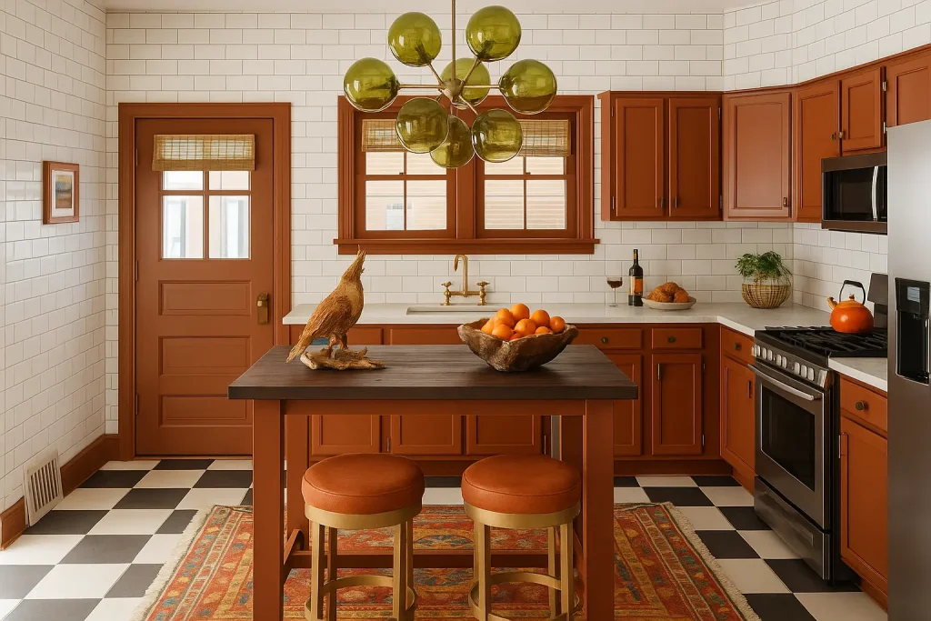


Warm Color Schemes for Different Kitchen Styles
Rustic
Rustic kitchens are all about natural textures and earthy tones, making them the perfect canvas for warm color schemes. Think deep brick reds, clay, burnt sienna, and golden browns that echo the beauty of raw wood, stone, and vintage finishes. Warm wood cabinetry, exposed beams, and copper accents bring a cozy, lived-in feel. Pair these tones with terracotta floor tiles or a warm-toned backsplash to enhance the charm. Add in wrought iron hardware or distressed finishes, and your rustic kitchen becomes a warm, welcoming space where every meal feels like comfort food.
Modern Minimalist
Warm color schemes might not be the first thing you associate with minimalist design, but they work beautifully when done right. In a modern kitchen, warm neutrals like beige, taupe, soft clay, and creamy whites add depth without overpowering the clean lines. You can warm things up with sleek wood grain cabinets, matte brass hardware, or a warm-toned backsplash in subtle textures. The key is balance: keep the palette simple, but layer in warmth through materials and lighting. The result? A minimalist kitchen that feels sleek yet inviting—not sterile or cold.
Bohemian
A bohemian kitchen is playful, artistic, and full of personality, so warm colors fit right in. Rich, spicy hues like mustard yellow, coral, terracotta, and even deep magenta bring soul and vibrancy to the space. Mix in patterned tiles, open shelving with eclectic dishware, and vintage light fixtures for an effortlessly curated look. Don’t be afraid to combine different warm tones and textures, this style thrives on bold, intentional layering. Add warm wood, woven baskets, and leafy plants, and your boho kitchen becomes a joyful, expressive oasis full of warmth and creativity.
Farmhouse
Farmhouse kitchens are made for warm, homey vibes. Classic color choices like creamy white, butter yellow, and soft sage get extra charm when paired with warmer elements like honey-toned butcher block, bronze fixtures, or rustic red accents. Shiplap walls, apron sinks, and open shelving create a cozy, functional backdrop for warm finishes. Consider a soft terracotta tile backsplash or warm beige cabinets with vintage pulls. Textiles like checked curtains or braided rugs in warm tones tie everything together. The result? A space that feels nostalgic, cozy, and ready for family gatherings.
Common Mistakes to Avoid
While warm color schemes can create a cozy and inviting kitchen, using them without a thoughtful plan can lead to design mishaps. Here are some common mistakes to watch out for:
-
Using too many warm tones without contrast can make the kitchen feel heavy and overwhelming.
-
Without neutral or cool accents, the space may lack visual balance and feel one-dimensional.
-
Mixing warm colors with clashing undertones—like yellow-based and red-based hues—can disrupt harmony.
-
Harsh, cool lighting can distort warm shades and make them look dull or lifeless.
-
Failing to consider natural light can result in colors appearing darker or more intense than intended.
-
Overusing glossy finishes can make warm tones feel outdated or overly reflective.
-
Abrupt color changes between the kitchen and nearby rooms can feel disconnected.
-
Applying bold warm shades across every surface can overwhelm the eye—use them selectively.
-
Filling the space with too many warm-toned accessories can create visual clutter.
-
Skipping test swatches increases the risk of choosing a color that looks wrong in your lighting.
Final Thoughts
Designing a kitchen with a warm color scheme isn’t just about style, it’s about creating a space that feels like home. From cozy terracotta accents to sun-kissed wood tones, warm colors bring comfort, character, and timeless charm to your kitchen. At Nelson Cabinetry, we offer a wide range of cabinet finishes to match your warm design vision. Not sure where to start? Our team is here to help with free 3D kitchen design services, we’ll bring your dream kitchen to life before you commit. Ready to warm up your space? Let’s design something beautiful together.
Looking for new cabinets? Gray Collection or White Collection

Nelson Cabinetry
Nelson Cabinetry is an online distributor of high quality kitchen and bathroom cabinetry. We pride ourselves in delivering a high quality product via an easy to use, convenient website. Placing your cabinet order has never been easier and you can do so from the comfort of your home, office or job site.