info@nelsonkb.com
 832-998-6598







Thinking about painting your cabinets? You might want to try color drenching. It’s a simple but striking design move where you paint your cabinets and sometimes the walls, trim, or even the ceiling all in the same color. The result? A bold, seamless look that feels modern and pulled together without trying too hard. Whether you lean moody and dramatic or soft and neutral, color drenching works across styles and spaces. In this post, we’ll break down what it actually means and share a few of the best colors to use if you’re ready to go all in.
What is Color Drenching Cabinets?
Is Color Drenching Trendy or Timeless?


The Best Colors for Color Drenching Cabinets
Deep Navy

Deep navy is a classic choice that brings drama without overwhelming a space. It’s bold, elegant, and pairs beautifully with both warm and cool accents. When used in a color-drenched design, navy can make a kitchen feel grounded and luxurious especially when carried onto the walls or ceiling. It works well with brass, gold, or wood hardware, adding richness and contrast. Unlike black, navy has a softness that still feels moody but more approachable.
Olive Green
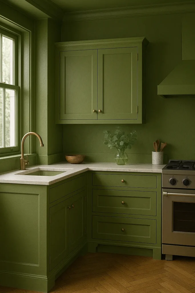
Olive green is earthy, calming, and perfect for creating a cozy, natural look. When used in a color-drenched palette, it brings depth and warmth to the space while still feeling neutral enough to work with a variety of finishes. It pairs beautifully with wood tones, terracotta, matte black, or brass. Olive green feels rooted in nature, which makes it ideal for kitchens that aim for an organic, lived-in feel. It’s also incredibly forgiving, hiding fingerprints and wear better than lighter shades. For anyone looking to step away from white but not go full bold, olive is the perfect in-between.
Warm White

Warm white offers a subtle approach to color drenching creating softness, light, and a feeling of calm. Unlike bright or stark whites, warm whites (think creamy or ivory) bring warmth and depth to a room, especially when used across cabinets, walls, and trim. This tone works in both modern minimalist and classic spaces, offering flexibility and timeless appeal. It reflects light beautifully, making smaller kitchens feel more open and inviting. Warm white also acts as a perfect backdrop for natural textures like wood, stone, or woven materials. If you’re after a clean look without coldness, this shade is ideal.
Charcoal Gray

Charcoal gray strikes a perfect balance between edgy and elegant. It’s bold but not black, offering depth and dimension without making a space feel too dark. In a color-drenched application, charcoal gray cabinets create a sleek, modern vibe that’s both sophisticated and versatile. This shade plays well with metal finishes like brushed nickel or matte black and can lean either industrial or soft depending on the styling. It’s a great option for anyone wanting to make a design statement without going overly trendy. Plus, its durability in appearance makes it ideal for high-use spaces like kitchens and laundry rooms.
Terracotta

Terracotta is warm, earthy, and full of personality. It brings a Mediterranean or Southwestern charm that instantly makes a space feel welcoming. When used in a color-drenched scheme, terracotta cabinets wrap the room in a cozy glow, adding natural richness and texture. This color pairs wonderfully with warm metals, open shelving, and handcrafted details. It’s a great way to introduce color without going neon or overly saturated. Terracotta works especially well in eclectic or boho-inspired homes but can be adapted to rustic or even modern interiors with the right accents. It’s unexpected but approachable.
Tips for Pulling Off the Look
Looking for new cabinets? Gray Collection or White Collection

Nelson Cabinetry
Nelson Cabinetry is an online distributor of high quality kitchen and bathroom cabinetry. We pride ourselves in delivering a high quality product via an easy to use, convenient website. Placing your cabinet order has never been easier and you can do so from the comfort of your home, office or job site.